A lot of time, effort and resources go into creating a professional, business website. You pay for designing and developing the website, spend hours in selecting the right design template for it, and end up investing in some expensive Pay-Per click campaign (Google ads) to promote it. But if you are struggling to convert those website visitors to customers, then keep reading to find out what could be wrong and how to fix it.
The thing is, website design should be more focused on your target market; people who fit your ideal customer profile and are more likely to convert. Creating such a website requires a lot of thinking and planning. Below, we share with you 5 guaranteed ways to guide your design process and help your website become a powerful sales funnel with lots of potential consumers.
1. Pay Attention To the Visuals
More than anything, it’s the visuals that inspire people to visit you and remain on your website for long. High-resolution images, original photography, a fantastic professional logo, attractive display of colors (whether neutral or otherwise), and strict adherence to the site’s color scheme show your potential customer that you know what you are doing.
Let’s break it down into three important aspects:
• Original photos
• Consistent color scheme
• Visual hierarchy
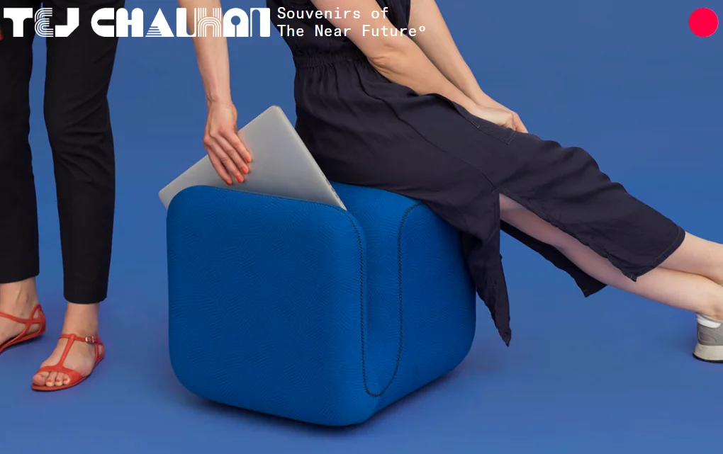
We are going to understand these three by using a live website example: Tejchauhan.com.
Tej Chauhan is an emotive industrial design artist who designs futuristic and intuitive products for a wide range of industries.
His site is a study in using original photography to its maximum impact. The products are impressive already but are presented with such simple and beautiful prominence that it enhances their appeal. Using original photography is a must if you want to appear authentic to your audiences.
Stock photos make you look lazy at best and shady at worst. Taking original photos isn’t expensive or difficult. Just use a good camera (your iPhone will work) and take real photos of your products. Original pictures add integrity and authenticity to the business.
Also, choose a color scheme and stick to it. Tej uses blue, grey, white and a spot of red/orange. This visual symmetry makes the site look professional and allows the products to shine. It tells a potential customer that people taking care of this business are organized and structured.
The site uses colors as well as fonts to create the hierarchy. Solid tints of color are given center-stage while pastels are used in the background. Simple fonts in varying sizes tell us which part of the information is most important and should be looked at first.
To bring the highest-potential consumers to your site, attract them with solid web design: simple, to-the-point, and containing original pictures that they can trust.
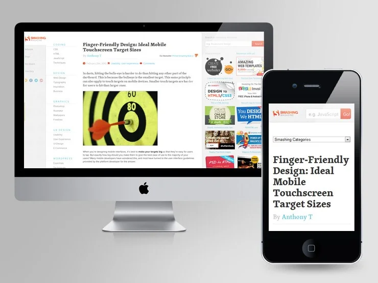
2. Responsive Design
Web designs that change their dimensions and the way they display information with altering screen sizes are called responsive designs. For example, if you are viewing this on a mobile phone, the text size, photo resolution, and alignment, etc. will adjust themselves to fit your mobile screen.
Even when you are on a desktop and try to resize your window, a responsive website should alter its dimensions and visual presentation to fit the changing size.
As you aim to bring more niche and high-potential customers to your website, keep in mind the fluid way they access the Internet: through their smartphone, tablet, desktop, laptop, etc. When you design a website that responds to the user’s way of accessing it, it adds phenomenally to the user experience. Google consistently ranks responsive sites higher in SERPs and demotes sites that aren’t. As a result, with responsive design, your site’s SEO directly improves.
The two most defining features of responsive web design:
• Flexible grids that automatically rearrange themselves to fit the screen size they are being viewed on.
• Flexible visuals with resizing containers that allow the heavy files to exceed specific dimensions.
Responsive web design allows your site to not hurt its visual appeal no matter the size of its container screen.
And while you are at it, you might also consider delving into mobile first optimizations of your website. Some aspects that you may consider, include, designing for small screens so that they are easy to navigate; information is clearly visible on mobile as well as imagery and layouts are uncomplicated. The aim of the mobile first design is to ensure that mobile users can quickly access your business information on the go and make quick decisions. If it’s not viewable and clickable, then it will most likely result in lost customers. This is why it’s worth investing your time in this.
3. Loading Speed
Nobody has time to wait for a site that takes more than 3 seconds to load; no way. People aren’t even waiting for Amazon to load only a second slower, so you and I don’t even have a chance. People equate a site’s load speed to its credibility and professionalism.
It’s very similar to why visuals are so important to people. It’s about impression as well as ease of use. The site that loads fast gives people what they are looking for instantly. If the images on your site are rich and heavy and will take a bit of time to load, make your text load faster so people have something to do besides getting frustrated.
Page load speed also affects your search rankings. Google routinely penalizes sites that are slow to load. And by slow we mean they take 3 seconds to load. Can you believe that? Probably not. In these ultra-fast times, fast internet has psychologically trained us to expect results faster and anything a bit slower just looks bad and unreliable to us.
While people are not forgiving for slow-loading desktop websites, the majority expects the mobile site to be a tad slower than its desktop version. And that’s also because of habits. We are used to mobile sites that are slower to load – but it’s changing. With Google’s mobile-first indexing policy, sites need to perform better than or as well as their desktop counterparts. So, you don’t have a lot of leeway.
Make your loading speed better and keep your visitors engaged. This also holds true for buying behavior. If your website is not allowing customers to purchase the item they want at that moment, then they will most probably move on to your competitor. Keep that in mind the next time you are at your desk tweaking your website for improvements.
4. Get Rid Of Click baits And Popups
How many popups have you clicked on lately? Or any of the clickbait sites that you visit regularly and have become a patron of?
The reason is people don’t usually engage with popups click-baits; the former is annoying and the latter is just misleading. They distract you, throw a hurdle in your user journey, and do not offer anything of value. Some people argue that popups work and bring in valuable leads. Counter argument: yes, incessant telemarketing works too but does it make it less annoying? A lot of people simply do not engage with popups and close them off as a reflex.
It’s true for click baits too. Phrasing your content headings in ways that entice users is fine but then the content should be ‘more’ of what the heading was and not just a big, fat lie. Seriously, rid your website of all popups and click baits. And even if you really have to, then make it more user-friendly. A clickbait that only pops up when user show their intention of interacting with the website or they are looking for the required information designed in the popup; or even popups that help divulge important information about the product or deal. The key to successfully include such popups without annoying the customer is by allowing them to make the choice to click them off easily.
5. Trust Badges For Ecommerce Sites
Trust badges, testimonials, and reviews add the trust factor in your website. It tells people that your business is legitimate and that others have engaged with it and found the experience satisfactory. Hopefully even more than satisfactory.
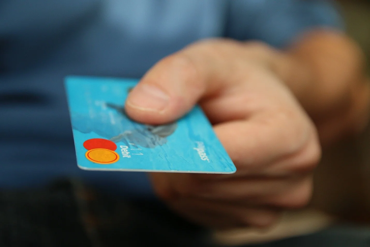
Ecommerce sites especially gain trust and credibility with display of trust badges from credit card companies and other digital payment service providers. Customers view these buttons as assurances of a safe, secure and convenient checkout process. Trust badges also include security icons and other details that let users know their payment will be securely handled and processed.
Conclusion:
Your website design is your first impression on a potential customer. To attract the most ideal customer to your website, invest in learning all you can about that ideal customer’s ideal user journey on a site. You can do that by research, analysis, and by engaging with a focus group of your ideal customers.
If your startup cannot invest in such costs at this stage of the business, our website designers can lend a helping hand. Feel free to reach out to us at info@telkoware.com OR (437)223-1771.
Author Bio
Alice Scott is a passionate writer and blogger who specializes in topics related to digital branding, blogging, and online business. She loves having Churros with her cat Chubby and morning walks.


